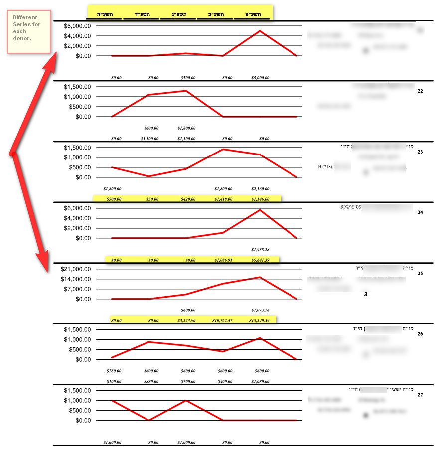
This is a new type of report that we can customize that includes a graph display for each donor. This type of report is not included in the software support. After getting all the details on how you want it we will give you a price (approx $250 for something like this
This includes the name and info on each account on the right, five years of pledges and donations on the bottom left, with a graph for each donor based on his donations. So the graph should work even for a mix of ranges. As you see the first donor on top has a top range of $6,000 while the 4th has a top range of $21,000. And each in between have there own customized series. If interested in such a customized report contact sales.